How art directors use film references to win pitches
Before a single word of a treatment is written, the pitch is already being built in someone's head as a series of frames. Art directors who consistently win pitches are not necessarily better writers or better strategists, they are better at translating a mood into a visual argument that is impossible to misread. Film references are how that argument is made. Not as decoration, and not as inspiration. As evidence. This article looks at how that process actually works, from the first reference search to the moment the deck lands in front of a creative director or a client.

Why film references win pitches (and why mood is not enough)
Verbal mood descriptions in a pitch are almost always imprecise. "Warm but modern." "Cinematic but not slow." "Edgy but accessible." These phrases communicate something about the direction you're moving in, but nothing about where you intend to land. They are not a shared language. A client hearing "cinematic" will picture something completely different from a DOP hearing the same word.
A well-chosen film still communicates light temperature, compositional grammar, colour treatment, and emotional register in a single image. Words cannot compress that much information into so little space. This is why the strongest pitch decks, in advertising, music video, fashion campaigns, are not dominated by copy. They are built from references that make the viewer feel the project before a brief has been formally written.
The critical distinction is between references as inspiration and references as argument. Inspiration references are background material: the films and images you absorbed while arriving at an idea. Argument references are precision instruments. Each one is chosen because it communicates something specific about the project that could not otherwise be said clearly. Pitches that use references as arguments win on clarity. Pitches that use references as inspiration win on atmosphere, which is a much thinner margin.
This applies across formats: advertising treatments pitched to agencies like Wieden+Kennedy or Ogilvy, music video decks presented to labels and artists, fashion campaign briefs for seasonal collections, and editorial presentations for magazine commissions.

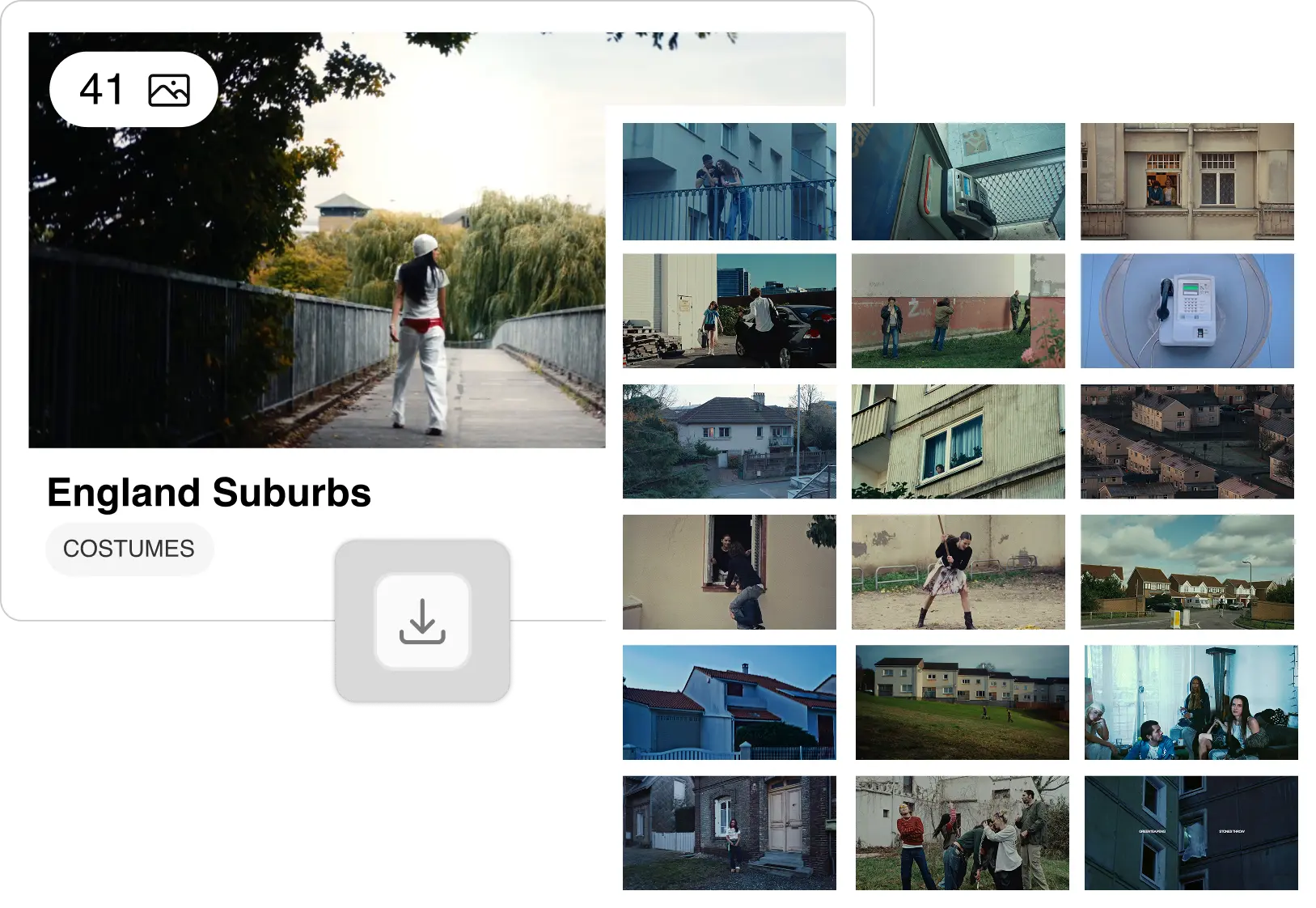
The reference workflow: how top art directors build their decks
The reference workflow that produces the strongest pitch decks is not "gather images and arrange them attractively." It has discrete steps, and skipping any of them tends to show in the result.
Step one: identify the register. Before searching for anything, know what kind of reference you need. Is this about the quality of light? The colour palette? The compositional relationship between subject and space? The emotional tone the audience should occupy? Each register requires a different search and a different eye when reviewing results.
Step two: start with one precise frame. Not a mood. Not a film title. A single frame that carries the thing you cannot yet describe in words. This becomes the centre of gravity for everything else. Every subsequent reference either supports it, extends it into another register, or introduces a productive tension that complicates it usefully.
Step three: search by description, not by title. The reference that will communicate your exact visual intention is rarely the one you already know. It is more likely in a film you have never searched for, which means arriving with a title produces the wrong results. Describe the visual quality you are looking for instead.
Step four: limit ruthlessly. 8 to 12 references that build a coherent argument. Not 40 that demonstrate range. The editorial discipline of cutting to 12 is where the actual pitch thinking happens.
Step five: annotate each frame. One line per image, not the film name and year, but what this specific frame is doing in the context of this specific project. "This is the quality of light for the product close-up" communicates something a production team can work with. "Terrence Malick, The New World" communicates a taste position, not a brief.
The strongest pitch decks don't show taste, they show evidence. The difference between a reference deck that impresses and one that wins is specificity: taste is what you bring to the search, evidence is what you give the client.
Choosing the right references: what to look for and what to avoid
What makes a strong film reference for a pitch
The frame needs to communicate exactly one thing clearly. Not a beautiful image that means many things. A specific image that means the specific thing you need it to mean in this context. Specificity is what separates a reference from a mood image.
Film stills carry intentionality that most other image types do not. Every element in a film frame was designed: the lighting setup, the colour grade, the staging, the lens choice. When you pull a frame from a 1981 Italian crime film, you are borrowing the outcome of deliberate decisions. That density of craft is what makes film stills useful as precision instruments rather than atmosphere generators.
On the question of obscurity: over-referenced images carry less weight in a pitch than you might expect. A client who has already seen Blade Runner 2049 used as a reference in five other presentations will not experience your version of it as a vision. They will experience it as a starting point they've seen before. Unexpected precision, the right frame from a film nobody in the room has heard of, communicates more authority than a celebrated image deployed for the thousandth time.
What to avoid
Pinterest boards surface what is popular, not what is precise. The images that have been shared most widely are the images that will communicate least distinctively in your deck. The same applies to a first-pass Google Images search.
Avoid "tone" images that feel right in isolation but do not communicate anything specific to a production team. A beautiful landscape from an unknown source carries a feeling but not a brief. A frame from a specific film by a specific cinematographer carries a visual language that can be translated into decisions.
Finally, watch for references that impress individually but do not work together as a set. A pitch deck is not a portfolio. The references should build a coherent visual argument, not demonstrate the breadth of your influences.
Making references work in a pitch deck
A reference deck is not the end product. It is the translation layer between a concept and the people who will execute it. That means it needs to serve different conversations simultaneously, and the same deck does not always do that equally well.
For a client, the reference deck should make them feel the project before a word of copy or a scene description is read. The emotional register should be immediate. This is why the opening references in a deck matter more than the closing ones: the first impression establishes the visual world the entire pitch lives inside.
For a DOP, each frame should communicate something about light and space that translates into a setup. A reference that communicates the colour grade but not the light source is half a reference for a cinematographer. For production design, the most useful references communicate space, texture, period, and scale.
In practice, building one deck that serves all three audiences is difficult. The cleaner solution is to either annotate carefully after export, labelling each frame with what it communicates and to whom, or to build two lightweight versions: one for the client presentation, one for the production brief. If the client deck is the immediate next step, the Canva integration lets you bring the moodboard directly into a presentation without rebuilding it from scratch.
For advertising creatives working with agencies, the reference deck is also the connective tissue between the visual strategy and the production estimate. A well-organised reference set communicates scope and visual ambition precisely, which affects how the production is budgeted and how the director treatment is written.

Tools that matter in the reference workflow
The standard toolkit has real limits. Pinterest is a discovery tool, not a precision instrument. Google Images surfaces what has been indexed and shared most widely, the opposite of what precise reference research requires. ShotDeck has strong technical metadata and covers films, ads, and music videos, but its library skews toward US productions and its search is keyword and metadata-based: you arrive with a title or a technical parameter in mind. It is a solid tool for DOPs working in American narrative cinema; a narrower one for art directors drawing from European cinema, fashion films, or lesser-known international work.
Description-based search changes the starting point entirely. Flim's AI Search takes a natural language description ("low ambient light, green cast, tight interior, late 1980s") and surfaces frames from films you have never heard of that carry exactly that visual quality. Filters and tags then narrow the results by shot type, colour, and format when the initial pool is larger than you need. AI Search opens the field. Filters close it down. The search that finds frames by their visual content, not their title, is the practical difference between a reference deck that is everyone's and one that is yours.
Flim's library covers films, TV series, commercials, music videos, and fashion films, with broader international coverage than US-centric tools. Magic Board generates a reference board directly from a script or a pitch, following the chronology of the narrative: a fast starting point when the structure of the project exists but the visual language does not yet.
For sharing, Flim's collaborative boards allow the reference deck to be assembled and distributed from the same space. Annotations are added after export, in your editing software of choice. If the final step is a client presentation, the Canva integration moves the board directly into a deck without reassembly.
For a practical guide to the upstream process, finding and organising references before the deck is built, see How to find the perfect visual reference for your next shoot.


Got
Questions?

Art directors typically use film stills that communicate specific visual qualities: a type of light, a colour palette, a compositional approach, or an emotional register. The frame does not need to be from a famous film, it needs to communicate precisely in the context of the specific project being pitched.
Between 8 and 15. Enough to build a coherent visual argument; few enough that the argument is still readable. Decks of 40 images tend to communicate indecision rather than vision.
Yes. Film stills used as visual references in a pitch or director treatment are standard industry practice and fall within the convention of visual research and professional communication. They are not reproduced in the final deliverable.
Professional tools like Flim offer a library of over 2 million frames from films, commercials, music videos, and fashion films, searchable by description and mood rather than title or keyword. This allows reference searches that go beyond the over-circulated canon and find frames that are precise rather than popular.
A director treatment is a pre-production document that communicates a director's or art director's vision for a project. It typically combines written intent with visual references, including film stills, photography, and colour references. It is the primary tool for winning pitches in advertising and music video, and for briefing production teams before a shoot.