How to build a cinematic moodboard
A moodboard that works is not a Pinterest board with taste. It is a document that communicates a visual language: the specific quality of light in a late-afternoon interior, the colour temperature of a decade, the emotional register of a frame. This guide covers how to build one from the ground up: what to gather, how to organise it, and how to make sure it reads the same way in your head as it does in someone else's. The starting point is almost always cinema.
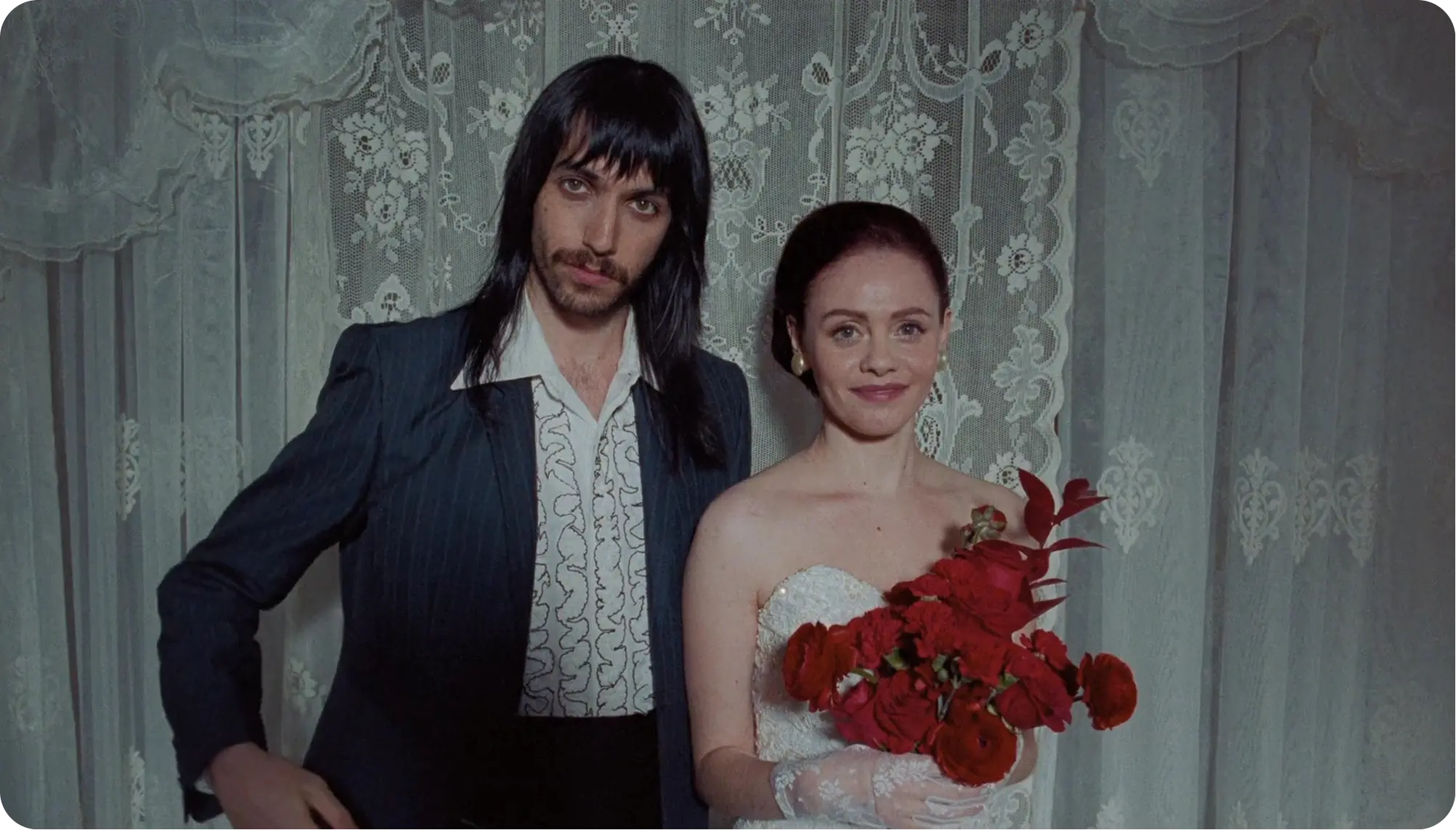
Start with a frame, not a feeling
Most creatives describe what they want before they know what they're looking for. "Something warm but not golden hour." "Quiet but with tension underneath." "Like that film, but not quite." These descriptions are not wrong. They are the beginning of a process, not the result of one. The moodboard's job is to translate a feeling into a specific visual argument.
The practical starting point: find one frame you cannot stop thinking about. One image that carries the thing you've been trying to put into words. Everything else in the board is built in relation to it: supporting it, complicating it, or extending it into a different register. A board built around one precise frame has a centre of gravity. A board built around a vague mood tends to drift.
The impulse to begin with abstract colour swatches or palette generators is understandable, but it tends to produce boards that communicate colour without communicating much else. Actual film references carry light direction, compositional logic, texture, and emotional register simultaneously. They are denser starting points.
.webp)
The role of film stills and video extracts in a cinematic moodboard
Film stills and video extracts from ads and music videos work as reference material in a way that most other images do not. A photograph taken on a commercial shoot carries the aesthetics of that specific photographer. A stock image was not art-directed with your project in mind. A film still or video extract is the output of a deliberate cinematographic process, framing, light, colour grade, production design, lens choice, that was designed to communicate something specific. That intentionality is what makes it useful.
A single film still communicates light direction, colour palette, spatial composition, and emotional register at the same time. It is a more information-dense reference than almost anything else available.
What to look for in a film still
The value of a frame has nothing to do with the film's reputation. What matters is what the image communicates. When you look at a film still, look at the ratio of shadow to highlight: is the image dominated by darkness or light? Look at the dominant colour: is it a cast, a grade, or a natural quality? Look at the use of negative space and how the camera relates to the subject. These are the variables that translate into production decisions.
Which eras and movements to mine
Some periods tend to produce stronger reference libraries. Italian neorealism and the French New Wave are dense with naturalistic light and compressed spatial compositions. 1970s American cinema (Coppola, Ashby, Cassavetes) has a warmth and grain that is extremely hard to reproduce without a reference. Contemporary Korean cinema (Bong Joon-ho, Hong Sang-soo) handles colour and interiority in ways that are largely absent from mainstream Hollywood. Scandinavian naturalism does something specific with available light that cannot be described, only shown.
One note of caution: the film you already know is often the hardest starting point. You bring your interpretation of the film along with the image, which can obscure what you actually need from it. The most useful references are sometimes frames from films you've never seen.
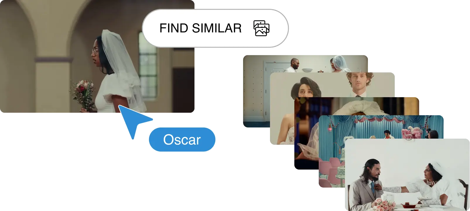
Flim's semantic search is built for the gap between knowing what you want and knowing what it's called. You describe the visual quality. It finds the frame. It's the search that finds the frame you couldn't name.
For moments when you have a script or a pitch and need to start building a reference set fast, Flim's Magic Board generates a visual board that follows the chronology of the script, pre-selecting frames that match each moment. It accelerates the visual research workflow without replacing the classic search. Think of it as the first pass that gives you something to edit from, rather than starting with a blank board.
The result is a library of references that is actually yours, not the same shortlist that every creative using the same two tools will arrive at.
Structure your board: colour, light, texture, tone
A cinematic moodboard is not a collage. It is an argument. Structure matters, and structure is what separates a board that communicates from a board that merely accumulates.
A practical approach is to organise references into four distinct visual registers:
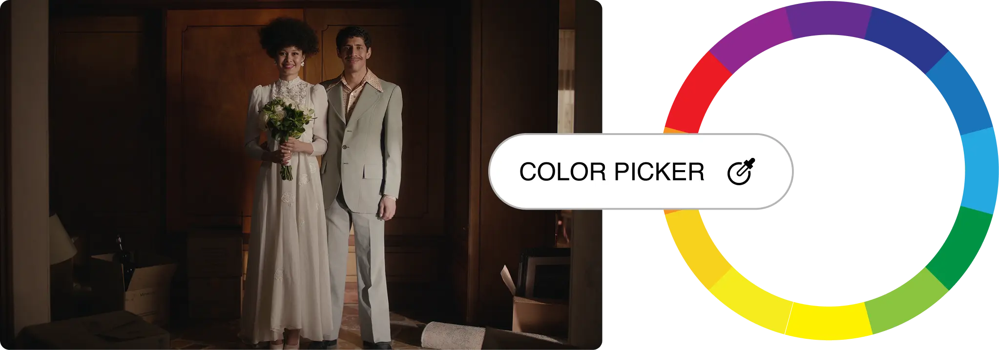
Colour references are actual frames that carry the colour you're after, not swatches. A frame from a particular film communicates a colour palette that also includes a quality of light, a grade, and a surface texture. A hex code does none of that.
Light references communicate quality and direction. Is the light hard or soft? Where does it come from? What does it do to the surfaces and faces in the frame? A DOP looking at a light reference immediately translates it into a setup.
Texture and surface references communicate how the image physically feels. Grain structure, depth of field, lens aberration, surface detail in the production design. These are often the most overlooked register in a cinematic moodboard and the most useful for a production designer.
Tone and emotional register is the hardest to quantify but the most important to get right. A face. A landscape. A relationship between two figures in a space. The register you want the audience to occupy when they watch.
Limit the board to 12 to 16 images. A board of 40 images has no argument. It has material. The editorial discipline of cutting to 15 forces clarity, which is the entire point.
Making the board readable to others
The board you built for yourself is not the board you share. The two require different versions of the same discipline.
When you look at a frame and choose it, you know exactly what it is communicating and why. The person receiving your board does not. Each frame needs at least one line of annotation, not the film title and year, but what it is doing in the context of your specific project. "This is the quality of afternoon light I want for the kitchen sequence" communicates something a DOP can work with. "Blade Runner 2049" communicates almost nothing on its own.
The board's role also varies depending on the audience. A director treatment uses references to communicate a complete visual world to a client who needs to feel the project before they commit. A photographer brief uses references to communicate specific technical intentions to someone executing a setup. A production design reference communicates spatial and material language to a designer sourcing locations and props. These are different conversations. The same board does not necessarily serve all three.
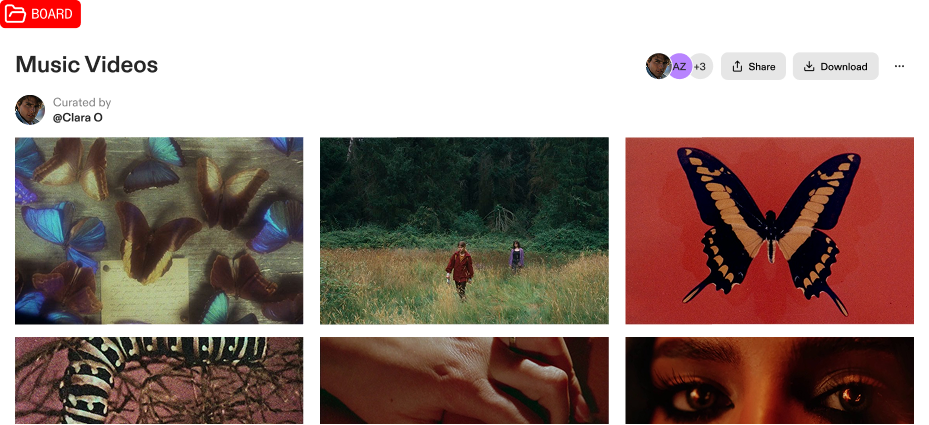
For teams building around a shared visual language, Flim's collaborative boards allow everyone to work from the same reference set, search, select, and annotate in the same space, without the usual cycle of exporting, re-uploading, and losing context between tools.


Got
Questions?

A cinematic moodboard is a curated collection of visual references (primarily film stills) that communicates the intended visual language of a project. Unlike a generic moodboard, it is specific about light quality, colour temperature, composition style, and emotional register.
A regular moodboard collects images that feel right. A cinematic moodboard makes a visual argument: each image is chosen because it carries a specific cinematographic choice that should inform the project. The selection is editorial, not atmospheric.
Fewer than you think. 10 to 16 carefully selected references communicate a clear vision. 40 images communicate indecision. The editorial discipline of cutting to 15 is part of the work.
Yes. Film stills and video extracts used as visual references in pre-production briefings, director treatments, and pitch decks are standard industry practice. They communicate aesthetic intent, they are not reproduced in the final work.
Flim combines a library of over 2 million cinematic frames with AI Search, filters and tags, and a built-in moodboard builder. You find references and build the board in the same workflow. To annotate frames, export and add notes in your editing software, or take your board directly into a presentation via the Canva integration.