How to find the perfect visual reference for your next shoot
The reference you're looking for exists. The problem is finding it without describing it in words that don't quite fit: "warm but not orange," "quiet but with tension underneath," "like that film, but not quite." Visual research is its own discipline, and for most of the production industry, it still relies on the same three or four tools that everyone uses. Which means everyone ends up with the same references. This guide covers a better process: where to look, how to search, and how to build a reference set that is actually yours.
Why most reference searches go wrong
The standard visual reference search starts with Google Images or Pinterest and cycles through the same canon of well-known films. It is fast, it produces results, and it reliably leads to the same shortlist that every other creative using the same approach has already seen. Keyword search finds what is famous, not what is visually precise.
There is a deeper structural problem here. When you search for "cinematic warm interior" on any major image platform, you get the images that have been tagged, shared, and aggregated the most. You get Blade Runner 2049 warm interiors, Wes Anderson warm interiors, and a long tail of Pinterest boards that reference each other. What you do not get is the frame from a 1974 Italian film where a single tungsten bulb is doing exactly what you need.
The reference that communicates your specific visual intention is rarely from the film you're already thinking about. And it is almost never the image that has been shared ten thousand times. The tools that surface those images are not the right tools for visual research at the level of precision professional production requires.
Knowing what kind of reference you need
Before you search, it is worth clarifying what you are searching for. Not all visual references serve the same purpose. A reference that communicates the right thing to a DOP communicates a different thing than one aimed at a production designer or a photographer. The precision of your search depends on knowing which problem the reference is solving.
For cinematography
A cinematography reference is about light. Specifically: light quality (hard or soft), light direction and source, the ratio of shadow to highlight, colour temperature, and what the lens does to the image. A DOP looking at a reference frame immediately starts translating it into a setup. Give them something that is visually specific rather than atmospherically beautiful.
For production design
Production design references communicate space, texture, colour palette, period, and scale. A specific shade of green in a period interior is more useful than a mood reference to "something a bit like 1960s Europe." The more precise the production design reference, the more efficiently it translates into sourcing decisions.
For art direction (advertising and editorial)
Art direction references tend to be about the relationship between subject and space, graphic composition, emotional register, and the tone the final image should occupy. This is the hardest register to find with keyword search and the one most likely to benefit from description-based visual research.
Where to look (and where to stop looking)
The case against Pinterest and Google Images has already been made, but the alternative is worth being specific about. What a professional film reference library gives you is intentionality. Every frame in a film is a deliberate choice. The lighting was designed. The colour grade was decided. The compositional relationship between figures and space was considered. Stock imagery and general photography cannot offer that level of craft density per image.
For professional reference research, the meaningful options are:
ShotDeck, which has strong technical metadata and covers films, ads, and music videos. Its search is largely keyword and metadata-based, and its library skews toward US productions, which limits the geographic and aesthetic diversity of results. For DOPs working primarily in Hollywood narrative cinema, that coverage is sufficient. For art directors drawing from European or Asian cinema, fashion films, or niche commercial work, the range is narrower than it appears.
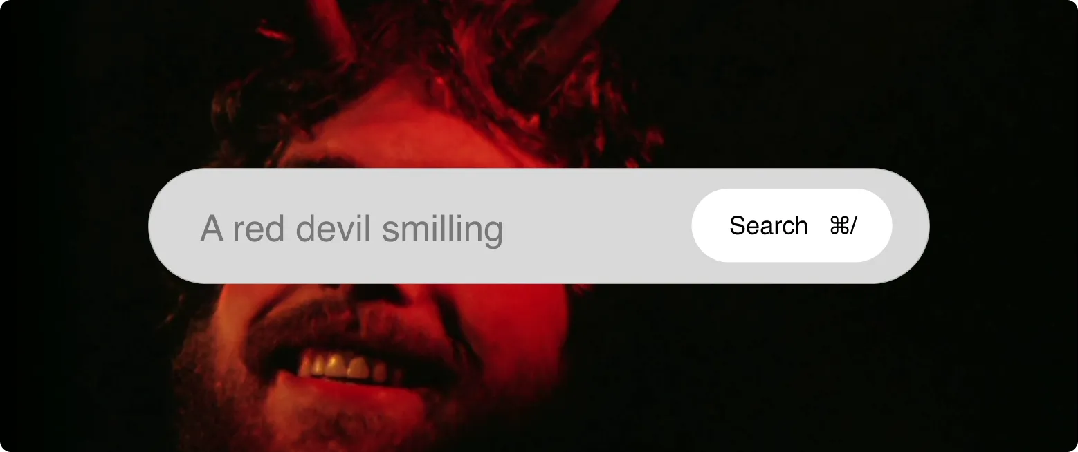
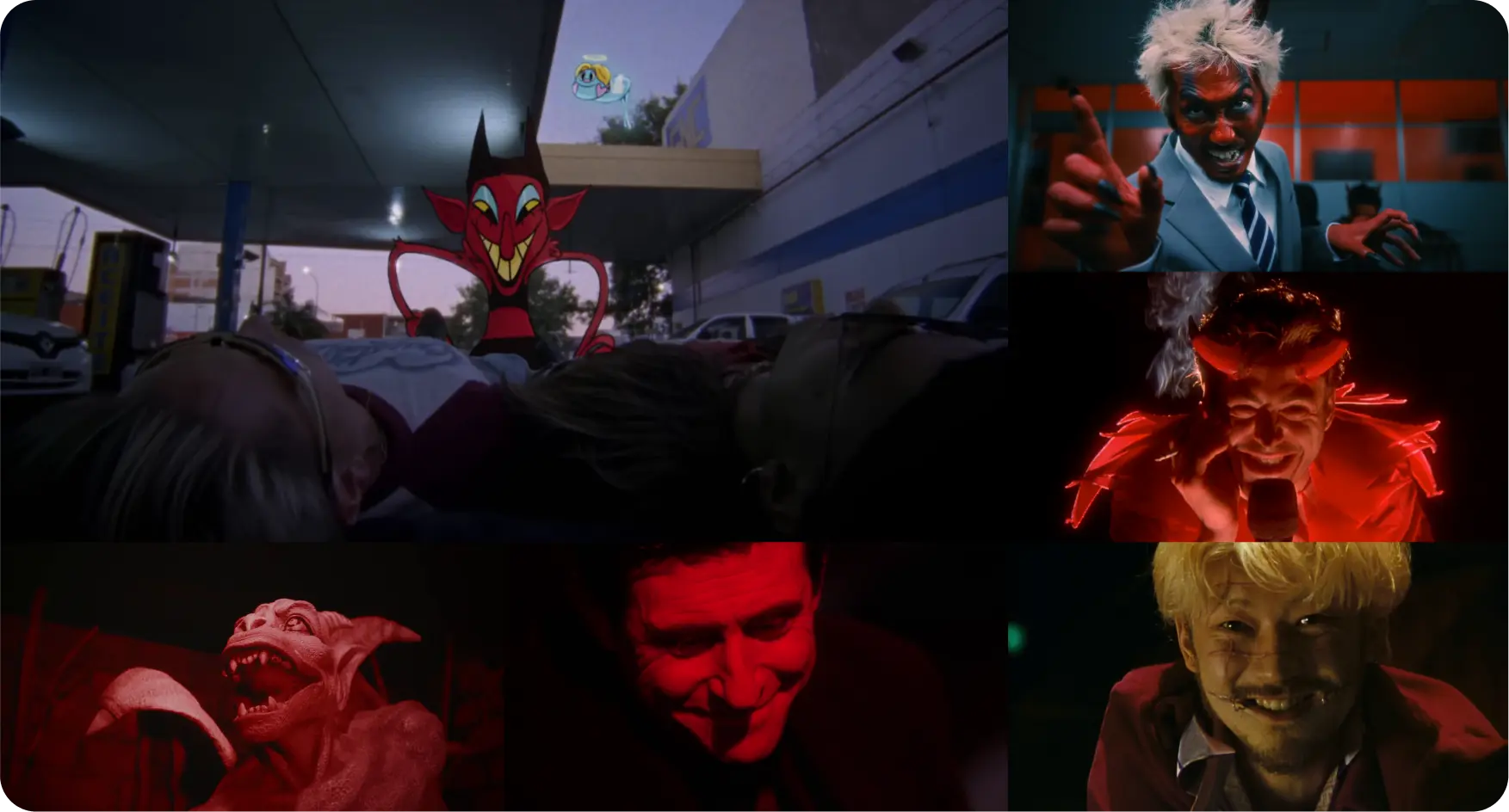
Flim covers the same categories, with a broader international footprint and two complementary search modes. AI Search takes a natural language description and surfaces frames that match the visual quality: "documentary interior, 1970s, single source warm light, close frame." Filters and tags then let you narrow by shot type, colour, and dimensions when you know exactly what you need. The two modes work together. For a direct comparison of both tools, see Flim vs ShotDeck.
The frame that communicates exactly what you mean is in a film you probably haven't thought to search. That's the point. A library of over 2 million frames from films, commercials, music videos, and fashion films, searchable by the visual quality you're actually looking for.
How to search by visual description, not just title
The shift from title-based to description-based search is the single most practical change in how professional visual research is done. Instead of arriving with a film title in mind and browsing its frames, you arrive with a description of what you need and let the search engine find the film.
A few practical examples of how that works:
Instead of searching "2001: A Space Odyssey" and hoping the frame you want appears, search "wide corridor, symmetrical composition, stark white, fluorescent ceiling." Instead of "French New Wave," search "Paris street, natural light, 1960s, grainy, candid mid-shot." Instead of naming the film, describe the image. The search processes your description against the actual visual content of frames, not their tags or titles.
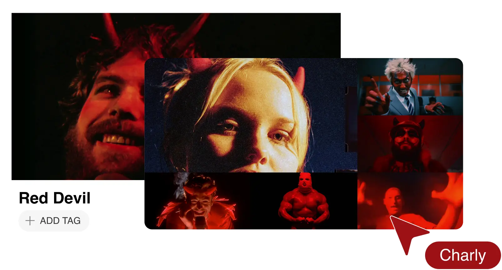
Flim's Magic Board takes a slightly different approach. You input a concept, a mood, or a brief text description, and it generates a curated starting set of references. It is useful with projects you need to illustrate quickly, based on a detailed script or pitch.
Building a reference set, not just a folder
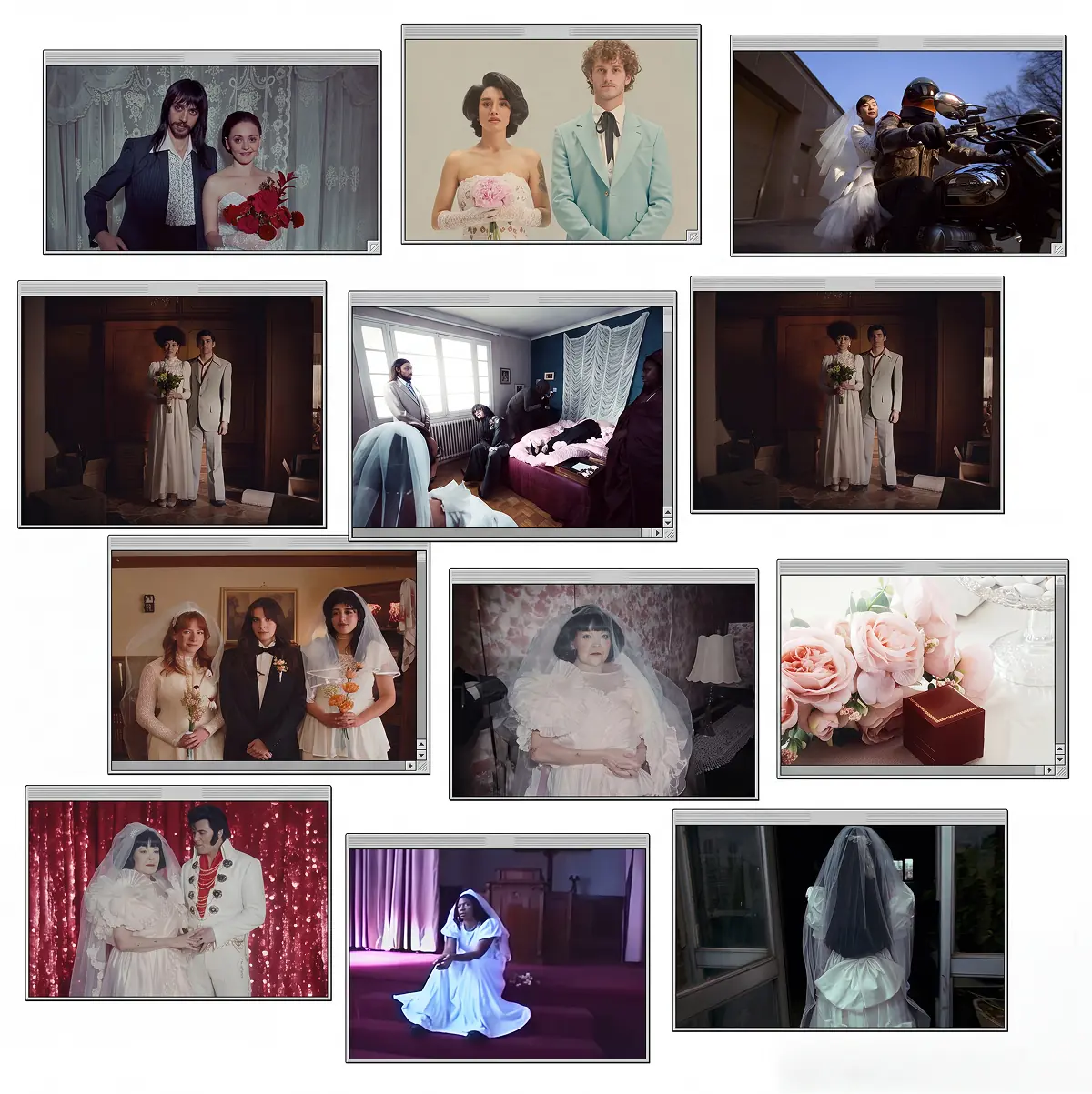
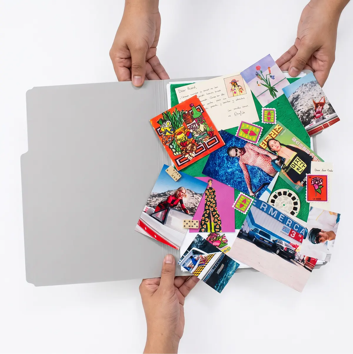
There is a difference between collecting images and building a reference set. A folder is a pile. A reference set is an argument, and every image in it earns its place by communicating something specific that the others do not.
How to organise: by visual register, not by source or chronology. Colour references together. Light references together. Texture and tone in their own categories. This forces a discipline in selection that leads to a more legible result: for you as much as for the people receiving it.
15 to 20 images is the practical ceiling for a shoot brief. Enough to cover the key visual registers with precision; few enough that the team can read the argument without losing the thread. A brief of 60 images does not communicate more vision. It communicates less confidence.
The references should be shareable in a form that preserves their context. A DOP who receives 40 unlabelled images does not know what to do with them. A reference deck of 15 frames with one line per image communicates what 60 unlabelled ones cannot. With Flim, you search, select, and share from the same collaborative board. Annotations are added after export in your editing software, or the board moves directly into a presentation via the Canva integration if the next step is a client deck.
Got
Questions?

A visual reference for a shoot is a specific image, often a film still, photograph, or painting, that communicates an intended look, light quality, colour palette, or emotional register to the production team. It replaces long verbal descriptions with precise visual information.
DOPs and directors typically draw from film archives, commercial reel databases, and photography. ShotDeck covers films, ads, and music videos with strong technical metadata, weighted toward US productions. Flim covers the same categories with a broader international scope, using AI Search (natural language descriptions) and filters and tags as complementary search modes.
Yes. Film stills used as visual references in pre-production briefings and director treatments are standard industry practice. They communicate aesthetic intent, they are not reproduced in the final deliverable.
Between 10 and 20, organised by visual register. More than that, and the brief loses clarity, the team cannot identify what is essential and what is supplementary.
Individual references are the raw material. A moodboard is the curated and structured set of references that builds a coherent visual argument for a project. A reference answers "does this image carry what I need?" A moodboard answers "does this collection communicate a complete visual language?"