How to make a film pitch deck, with the visuals that sell it
A film pitch deck is a short presentation, usually 10 to 20 slides, that sells a film or series to producers, financiers or a studio. It covers the story, the team and the market, and shows what the film will look like. The visual section is the part people remember: build it from precise references, not mood.
By the Flim team · Updated November 2026
A producer reads a pitch deck in a few minutes, often between two meetings. What stays afterward is rarely the budget slide. It is the three or four images that made the film feel real. That is why the best decks don't describe a mood with words like "cinematic" or "gritty". They prove it, frame by frame. Art directors have worked this way for years: a reference is evidence, not decoration. This guide covers what a film pitch deck should include and how long it should be, then the part most guides skip: how to choose and find the images that carry it.

What is a film pitch deck?
A film pitch deck is the presentation you send or show when you look for money, a producer or a partner for a film or a series. It answers three questions at once: what is the story, why this team, and why now. It usually comes after a logline has sparked interest, and before anyone reads the full script.
It sits next to three documents that people often confuse with it:
If you are still shaping the story itself, start with how to write a treatment. The treatment shows the film. The pitch deck sells it.
What should a film pitch deck include?
The order changes from one project to the next, but most decks that get read cover the same ground. Aim for 10 to 20 slides, the range most producers and guides agree on.
- Cover. Title, format, and one image that sets the tone before anyone reads a word.
- Logline. One sentence: who wants what, and what stands in the way.
- Synopsis. The story in a page or two, beginning to end.
- Director's statement. Why this story, why you, why now.
- Characters. The main ones, with what they want and how they change.
- World. Where and when it happens, and what that place feels like.
- Tone and style. The look: light, color, framing, camera.
- Comparables. Two to four recent titles with a similar audience or tone.
- Team. Director, producers, key creatives and attached cast.
- Production plan and budget. Format, schedule, budget range, financing so far.
- Audience. Who will watch it, and where.
- Contact. Who to call, and what you are asking for.
Most guides stop at "add high-quality images". Slides 1, 5, 6, 7 and 8 depend on them, and they are the ones a reader will remember. The rest of this article is about getting them right.

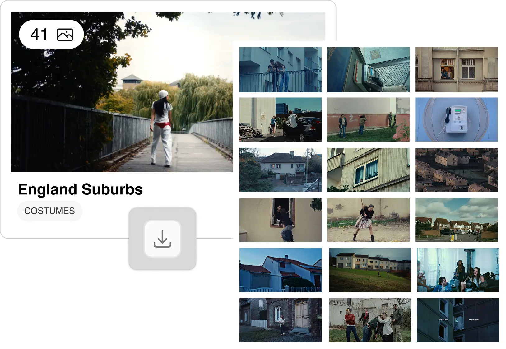
How do you build the visual section of a pitch deck?
A visual section works when every image answers a question the reader would otherwise ask. Art directors build it in five steps:
- Name the register. Decide what each slide must communicate: a quality of light, a palette, a way of framing people, an emotional temperature. One slide, one question.
- Start with one precise frame. Find the single image that says it best. It becomes the anchor, and every other reference has to agree with it.
- Search by description, not by title. "Low winter sun through a dirty window, cold blue shadows" finds frames a film title never would.
- Stop at 8 to 12 references. Per visual slide or section. Past that, the reader stops looking at each image and starts scrolling.
- Annotate every frame. One short line on what it does for this project: "this light for the interiors", "this distance from the actors". An image without a note is decoration.
Tone and style slides
This is where the deck shows the film before it exists. Split it rather than piling everything on one page: light and color on one slide, framing and camera on another, texture and costume on a third if the world needs it. A mood board is a good starting point, as long as each image ends up with a reason to be there.
Comparables: show the frames, not just the posters
Comparables tell a financier where the film sits in the market. Most decks show the posters. A stronger move is to show one frame from each title that captures what your film borrows from it: the pace, the palette, the distance to the characters. The poster says "this sold". The frame says "this is why yours will feel familiar and new at once".
Characters and world
Character slides gain a lot from a face, a costume or a posture that already exists on screen. World slides need places: a street, an interior, an era. Here too, a precise reference does the work of a paragraph.
The strongest pitch decks don't show taste, they show evidence. The difference between a reference deck that impresses and one that wins is specificity: taste is what you bring to the search, evidence is what you give the client.
How do you choose the right references?
Specificity is what separates a reference from a mood image. A reader can feel the difference even when they can't name it.
What makes a strong reference
- It is precise. It shows one thing clearly: this light, this framing, this palette.
- Its intent is readable. With its one-line note, nobody has to guess why it is there.
- It agrees with the others. The set builds one argument. It is not a tour of everything you love.
What to avoid
- Over-circulated frames. The same handful of famous shots appears in countless decks. A reader has seen them, and they say "taste", not "this film".
- Sources ranked by popularity. Pinterest and image search push what is already widely shared, which is the opposite of what a pitch needs.
- Images that contradict each other. Two palettes, two eras, two camera styles: the reader sees indecision.
How do art directors adapt a pitch deck to its audience?
The same references don't speak to everyone in the same way. Art directors adjust the visual section to who will read it:
- Producers and clients need to feel the tone at once. Fewer images, bigger, with the emotional register up front.
- The DOP needs light and space they can turn into setups: direction of light, contrast, lens distance.
- The production designer needs space, texture, period and scale.
Either annotate one deck for all three, or build two light versions: one to sell, one to prepare.
The logic is the same for an advertising pitch. An agency deck answers a brand brief instead of looking for financing, but the creative section is read the same way: a marketing team decides in minutes whether it can picture the idea on screen. The references are what make that possible.
Where do you find images for a film pitch deck?
Finding the images is where most of the time goes. The usual sources each have a limit:
- Pinterest is fast and endless, but it surfaces what is popular, often without credits.
- Google Images returns the same widely shared frames, at uneven quality.
- ShotDeck is a serious, credited library, searched mostly by title and technical tags.
Flim is built for the step those tools make slow: finding the precise frame you can describe but can't name.
- Describe the image. AI Search understands mood, light, era and framing in plain language, across more than 2 million images from films, TV series, ads and music videos, each with full credits. Filters narrow the result: Frame size, Release year, Color & lighting, Motion and more. Browse the film stills library on its own if you prefer to explore.
- Start from the synopsis. Magic Board, on the Pro plan, turns a script or a pitch into a first sequence of images that follows the story. It speeds up the search, it does not replace it: refine with AI Search once the direction is on the table.
- Add motion. When a still can't show a camera move or a rhythm, Video Cuts give you 600,000 short clips from ads and music videos, on the Pro plan.
- Generate the frame that doesn't exist yet. Sometimes the exact image isn't anywhere. Lock a direction with an Aesthetic, then generate the missing image or video with the latest models (Nano Banana, GPT Images, Veo, Seedance). See how to build your aesthetic.
- Build the deck. Share Boards with your team, then bring them into your slides with Flim in Canva.
For a broader look at the category, see our visual reference tool. One rule applies to every reference: it is there to pitch and to prepare the film, not to appear in the final deliverable.


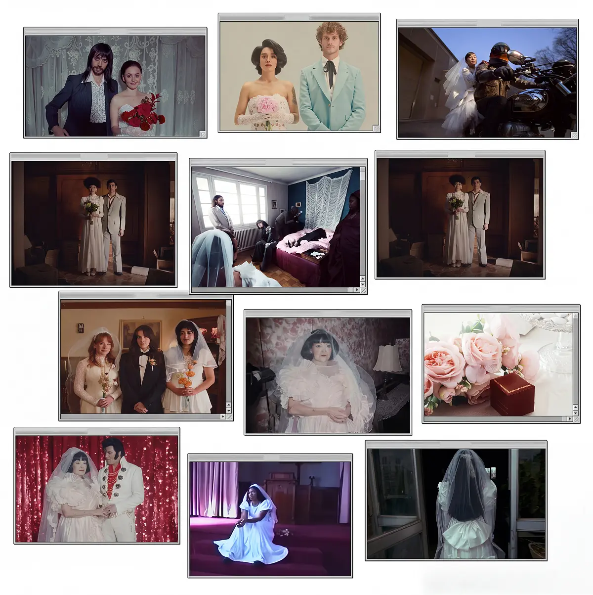

Got
Questions?

Most film pitch decks run 10 to 20 slides. Under 10, something important is usually missing, often the team or the look. Over 20, the reader starts skimming. If you need more room for images, put them in a separate lookbook.
A pitch deck sells the whole project: story, team, market, budget and look. A lookbook covers only the look, in more depth: light, color, locations, costume and camera. A lookbook is often sent alongside the deck, or folded into it as its visual section.
A treatment shows the film: it tells the story in prose, or shows the director's vision with references. A pitch deck sells the project: it adds the team, the audience, the budget and the plan. A treatment can feed the story and look slides of a deck.
Around 8 to 12 references per visual slide or section. Fewer and the direction stays vague. More and the reader stops looking at each image. Every reference should earn its place with one short note on what it shows.
Using film stills as references in a pitch deck or a treatment is common practice in the industry: they communicate a direction to a small group of readers. They are not meant for publication or for the final deliverable. If a deck will be shared publicly, check with your production or legal team.
They use dedicated reference libraries where each frame is credited and searchable. Flim lets you describe the image you need in plain language, filter by frame size, era, color and lighting, and search more than 2 million images from films, TV series, ads and music videos.